GET GET IT, IT LOOKS LIKE PHOTOSHOP
God damn I'm clever. This is a cool looking effect that was retardedly easy to do. OH GOD SHE'S DISAPPEARING Now she's white! Going, Going... Ears are nice sex toys, you know. Yatta, yatta IT'S THE DREAD PEN TOOL.
No, you can't zoom in.
This is a tutorial for intermediate and advanced Photoshop users who would appreciate a blow-by-blow of the process of tracing anime. It assumes familiarity with layer manipulation, selections, and other raster-style functions.

   The Quickie Photoshop Anime 'Vectoring' Tutorial
1. Pick and prepare your image.
2. Trace the lines.
3. Color in the image.
4. Final detailing.

    Pen Tool Functions Crash Course


   1. Pick and prepare your image.

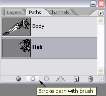
   Find an image you like. I mean really like, because you’re about to spend a lot of time with it. A trace can take anywhere from three hours to days.

   Preparation involves doing a lot of practical and oftentimes obvious stuff, but to give you an idea of what we’re going for, here are a few things to check off:
   • Getting a source image. Duh, but if you have more than one available, do not necessarily use the largest one or the one that’s got just the right coloring. You’re looking for clarity and sharpness in the lines.
   • If it’s a panned shot, piece it together first, and again, don’t sweat the coloring. All you care about here are lines and definition in shading and highlights.
   • If the image isn’t complete, as in the very top of a head is cut off, you can probably piece in your own idea of how it would look. Make the room on the canvas and draw a rough guideline for your work, both lines and the shading.
   • Are you going to ‘fix’ something about the image? Is some proportion off in a way you want to correct? (Happens a lot in Utena, especially to the male characters.) Do it now.
   • Toy with brightness/contrast, sharpness, and levels to get the lines pronounced for your convenience. This is especially important for characters with dark hair, as the lines tend to blend into the shading. Don’t overdo this, but don’t neglect the bit of help it offers.

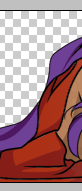
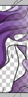
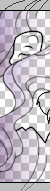
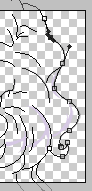
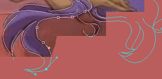
Here I've picked a lovely shot of Anthy from episode 38:
I love her hair. I hate her hair. You get mixed emotions after tracing this.

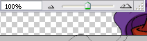
   Ready? Good. Now BLOW THE IMAGE UP. Photoshop is not naturally a vector program, and the pen tool doesn't create true vector images; the moment you draw a line or fill in a color, you’re back in raster imaging and subject to the same cruel laws. In other words, your final product should be as large as possible. Size does not change how hard the work is, and your only limit here is what your PC can handle. Generally, you want the image to be larger than the largest practical application for it, which is a wallpaper at a huge resolution like 1600x1024. I aim for anywhere from 1600 pixels to 3000 pixels in any direction. Remember: no matter how good you are, your image will look better scaled down a little from the size you worked with.

   Another thing to keep in mind is how complicated the image is, and how much detail you can reliably pull from the original. The more there is to do, the more impressive it will be at greater size, and the easier it’ll get to nab the minor details. A common screenshot is going to reach a point where more size isn’t going to make a big difference in clarity, but some images will shine all the brighter when blown to obscene proportions. Of course, those are the images that are detailed enough to make you cry when you’re several hours into them. They’re also the ones with varying line widths. Let me warn you right now: there’s no easy way to do that in Photoshop. Proceed with caution.


   2. Trace the lines.
   You may kick all kinds of ass in Photoshop and still have no clue how the pen tool works. It’s a vector tool in a raster program. You’re used to Photoshop moving in the direction of your mouse. You drag a line and the brush follows it. Vector, on the other hand, is based on the manipulation of points along a line to create a smooth curve. For this overview, I’m not going to explain how to use the pen tool, since I’m assuming a level of proficiency with the program that will allow you to figure it out yourself. However, if you’re learning by experience, mess with clicking, alt+clicking, ctrl+clicking, and right-clicking, as well as what happens with any of the above if you’re not clicking on the line or a point on it. (At the bottom of the page I do offer my own explanation of what these commands do, but for a thoroughly in depth tutorial on the pen tool, go here.)

The paths function of the pen tool.
Set the pen tool to create paths.
                                                      The first thing you’re going to do is create a new path layer and set your pen tool to create paths. (The second icon on the top left tool settings.) You’re going to plan ahead
Pretty, oh so pretty.
Anthy's hair is on a separate path layer from the rest of the image.
and decide if there will be sets of lines with different widths in your final product. This will happen in complicated images where you’ll want lines that define the body to be thicker than detail lines. Often, lines for the hair look better a bit thinner than the lines used for the clothes and body. You need separate path layers for the different line widths you’re going to use. In the case of Anthy here, her hair is going to be lined thinner than the rest of her, so it’s its own path layer.

   Now you begin lining. Nothing to say about that except that you do it. Keep your paths in order, name them, and when you’re done, go through your work and make absolutely sure they look the way you want: all the lines connect the right way, are curved just so, and generally as perfect as possible.

Reminds me of the hurricane track maps.
This is what the pen tool looks like in action.

Stroke path
Stroke your paths with the brush.
   Once you’ve lined the image in pen paths, you stroke those paths with the brush to create the lines themselves. First make a layer and name it your line layer. Then go to the brush tool and select a hard round brush. If your image falls into the dimensions I gave earlier, your brush should be 3 to 5 pixels wide. Anthy’s hair is 4 pixels wide and the rest is 5. Now while the brush is still your active tool (don’t switch back to the pen), click the ‘stroke path with brush’ button.

   Even if you've made separate path layers for different line widths, put all the lines on the same raster layer. Down the road, this will let you get away with using the magic wand selector tool in your coloring.

   Your final result is going to be a single layer that looks like this:

Looks pretty neat on its own, doesn't it?
Click here for a full-size image.

   You’ll notice in the full-size that the lines for the hair and body don’t always line up right, and that there are little flaws in the lining. Use this layer as a corrections guide and fix the paths and then restroke the paths on a new line layer. The vast majority of line flaws can be caught and corrected at this point. Click here for a full size of my corrections.

   NOTE: Wherever the lines connect in the original, make sure they connect in your line layer. The more blocks of color the magic wand tool can define, the easier your life is from here on. In fact, if you’re dealing with line art that in places completely fades away, I would save that effect for later and use solid lines first.