First, plot out how youre going to layer the colors. Break the colors into groups: hair, clothes, skin, etc. When you create the layers youll end up with sets of layers like hair, hair highlight,
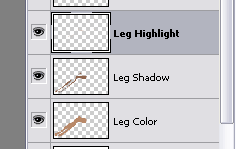
Organize your color layers.
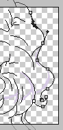
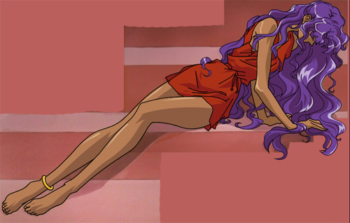
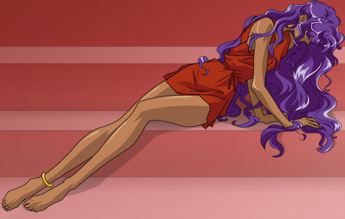
A word of warning: in a lot of images, what looks like the same skin/hair/whatever shade changes in one part of the image compared to another part. This minor difference will be noticeable in your final product, so sample around the image for base colors and compare. You may need to split sections down to say legs and arms because the colors are slightly different. This happens in this image; the arms and legs are slightly different shades. (In this case the variation stresses that her legs are closer to you than her torso.)
You want to start with the largest blocks of color and work your way down. Lets say youre coloring the skin first. The bottom skin layer is going to be the one thats easiest to define, and that will almost always be whichever shade is the most prominent. (For the skin itll usually be the base shade, with the shadows and highlights coming after.) This is where it becomes very convenient to have the lines all meet: use the magic wand to get the selection the right shape,
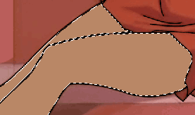
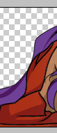
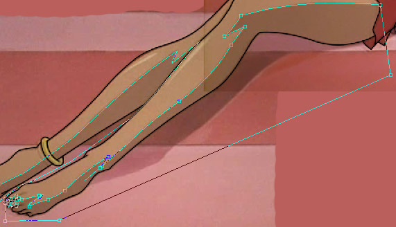
I've filled in Anthy's base leg color using the magic wand tool.
If, for some reason, the magic wand tool isnt cutting it here, youll have to use the manual selection tools or the pen tool (as explained below) to get to the same end. In most images, that wont happen much, but if its irritatingly frequent, you might want to make a copy of your line layer where you fill in the spaces to complete a guideline layer. You can discard it after you're finished coloring.
Now make this layer invisible, you need to see underneath. Time to play with the pen tool again. Youre going to use it, with all the same settings, to now define the sections your need to color other shades. You leave it creating paths, but now your paths must meet at their ends, you cant have just a line. Youre using the path tool to define what will ultimately be selections. (But Gio why not use the selection tool??? Yeah you get those curves just right that way, sport.) Dont worry about falling out of the lines for parts of the image that dont involve this set of shades at all. You can always load the base layer as a selection, invert it, and use it as a guide to delete that excess. For places where you got lazy and included in the selection parts that shouldnt be changed, well youll have to erase those bits of the layer later. This is easy enough since you dont need much precision with 4 pixel wide lines of wiggle room.
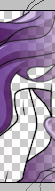
 This is what you're looking for in defining color blocks.
Once all the applicable parts of the image are defined this way, youre going to convert the paths to selections using the button just to the right of the one you used to brush stroke the lines earlier. Then go to the assigned layer, one just above the base layer, and fill. Use the magic wand or load the base selection and invert to get rid of where you colored over the edges, and the eraser to manually remove bits of color that you put over the base layer where they shouldnt be. You repeat this process for the highlights in the skin, until you have this:
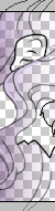
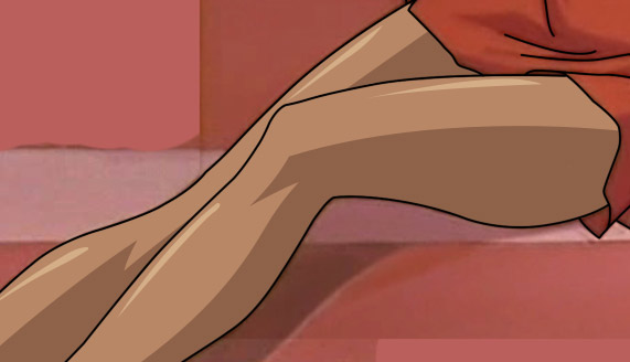 Anthy's leg all nice and colored.
Obviously I used a simple part of the image to show this, but nothing about the process except how long it takes changes when you get to the hard stuff.
Once your image is colored, youre likely going to mess with the specific shades again, since its pretty rare that a screenshot is ever the shading its supposed to be. This usually ends up being you brightening the colors. Easy enough to do since each color is on its own layer, right? Here is my before and after:
 Before and after the color correcting.
As you can see, I upped the overall contrast of the images and brightened the colors. Not all images would be as contrasted as this one, but Anthys hair highlights are very prominent in the image and it suggests harder lighting.
I added some highlights to the hair over her hand, which seemed appropriate considering its location and how the hair was positioned. Such things may be added or not at your discretion. Most of the time, I try not to change things too much, but keep in mind there are situations where you can improve on the original. Increasing the size of the image to the degree you are will bring otherwise minor flaws to the surface, and its up to you whether to leave them out of faithfulness or trust your own ability to correct or improve them.
I also tinkered with the coloring of her arms against the coloring of her legs. In the original image, her legs are slightly lighter and less contrasted to create the appearance of varying distance from the viewer.
This is all very exacting work based almost entirely on your own eye for how it should look. Often youll find sticking with the colors in the original gives you a washed out image, especially if pulling from a screenshot. Your eye and experience are key here, and its also where Ill mention a pitfall of that fancy-pants LCD flat-panel monitor you got with you new PC: IT SUCKS AT COLOR. If at all possible, do coloring work on a plain old CRT huge-rear-end monitor. LCDs are usually far too bright, and extremely dark or light colors will just turn into black and white. If you must use an LCD, turn the brightness on it down a bit to something more like a CRT or a television screen. Still, keep in mind theres a reason most graphic artists prefer CRTs.
Finally, heres a cross section of the completed image before detailing.
|
 |
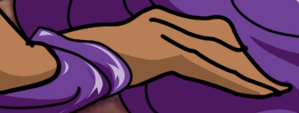
How much of a perfectionist are you? Well youre about to find out. But like the rest of the work youve done, youre going to start big and work your way down. Something I ended up saving for this stage turned out to be Anthys hand:
 That's a hand the same way Akio's car is a truck.
YIKES. What the crap was I thinking? This should have been corrected before I colored the image, but if you think youre going to do that every time, with everything, youre dreaming. This might have seemed obvious, and it was, but youll run into things that look this wrong in the final product even if everything seemed fine with your lines. It happens often with hands, eyes, and otherwise very detailed parts of the image. Where most of Anthy was easy enough to line, this here is very specific and a small area to work in.
There are a few ways to approach this. For this example, Im going to go back to square one and re-vector the lines.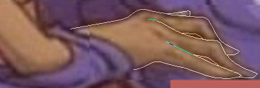 Ahhh. Much better. You can see where I still had to kinda make up the lines where there was just too much blurring and not enough detail.
I then repeated the process with the coloring. This is where things get tricky. The coloring (and the lines for that matter) were not clearly defined here. I also ended up moving her hand a bit closer to her arm; a deliberate correction of the original. This is all plain old tedious Photoshop, using things you should be familiar with. Don't forget, youll have to go back and change the coloring to fit the new lines. Yes, that looks vaguely like a hand. I could have made the shading between her fingers more specific, but that's a level of detail that would be inconsistent with the rest of the image, and that can stand out in a bad way.
Now for the really tedious stuff. How you go about the rest of the detailing depends greatly on how much of a perfectionist you are. I zoom in to about 300% and go through the entire image correcting any manner of flaw I come across. Namely these are places where the coloring isnt fitting quite right into the lines, or small imperfections in the lining. Either a wobble or two lines arent meeting right. You can correct these however you like, using the pen tool and relining or doing it by hand.
This is also where I do the line tapering. You could leave them alone with their stubby rounded ends, and a lot of people who trace images in Photoshop do, but it doesnt look right to me, and if youve put in so much time already, why are you going to wuss out now? This effort makes a huge difference especially in hair, where it just doesnt look right without the lines tapering at the ends. How you get this accomplished will vary depending on the line and how you like to go about things. Your options are manually erasing, using the polygonal lasso tool to cut off the corners, or using the pen tool to create a rounded taper. Generally, short tapers can be done with the eraser. Very long tapers (which show up a lot in straight hair) are most likely to need the pen tool. Ones that fall in the middle are quickest with the polygonal lasso tool.
When doing the final detailing, it helps to make the background invisible, this will bring to light little bits of missing color and such that you wont see on your own. Look to places where you did corrections, theyre going to suffer this the most. See what I mean? This disappeared into my solid pink background, but it's the kind of thing that will become glaringly obvious the moment you try to use your trace for something else.
But wait! What about the background? Well that is entirely up to you. Personally I almost never make the background, since most of the things you do with a vector trace don't require a background anyway where you'll just be providing one of your own. Also, you will never get the background to look quite the way it should, since theyre painted backgrounds. So what you do here depends entirely on you.
In the case of this image, I made a background since it wasnt entirely impossible to do. I wont explain how I did this since it fits nice and squarely into Photoshop functions youre likely very used to. Noise, blur, feather selection, gradient, etc.
 Oh yeah, baby. Click here for a full-size of the trace minus the background.
Or not. Do yourself a favor. Put the trace away. Go watch a movie, read a book, spank your monkey mouse, whatever. Return to it a day or two later and give it a good hard look. You will probably find little things you missed before. No matter how careful you were, this will happen. Why? You were staring at the image for hours/days. You lost perspective. Dont beat yourself up over it, unless youre into that sort of thing. Once your image passes this fresh look test, youre really, truly done.
...Unless youre me. I often make the image into a plain wallpaper and tinker with it over the course of days before I call it done. Having it on the desktop lets me catch a lot of little things you only see in casual glances. You might not need to do this, or you might simply say screw that. Youre probably fine, anyway, but just do whatever makes sense to you as far as perfecting the image. Thats the point of vector tracing. Making a huge, fantastic copy of the original. Youve already put in hours of work, dont let some minor detail mar it.
Here (9MB, zipped) is the actual PSD file of my work. Im leaving this for download so that you might look around and actually see for yourself what this looks like. I didnt include all the paths required to do the image, but the line paths and many good examples of the paths used for coloring are still there. Naturally all the color layers are there. This is for those of you who learn best by poking around the finished product. Dont be an asshole and steal it like its your work.
|
|
Just Click
•This is the main pen tool function. Click and drag to mess with the path.
•Click where you want a new point, or click on a point to delete it.
•This also converts end points back into regular points, in case you need to add more to the path.
Control + Click
•Do this to select a path and also do this while clicking off the path to deselect it (youll need to do this to start a new one without making another path layer).
•Also do this to mess with points youve already made. Did you miss the line a bit? Ctrl+Click and drag to move an anchor point.
•Ctrl+Click also alters handles. Handles are the two lines, angled 180 degrees opposite from one another, that come out from a point when you start messing with the curve of the path. Ctrl+Click will edit both handles, changing both sides of the path from the point.
Youll use this a lot, its the general editing function.
Alt + Click
•Do this when the curve Photoshop forces isnt falling in with the one you need to make. You're removing the handle that would dictate the curve made by the next added point. Use it when necessary, but keep in mind that perfect curve Photoshop was making before will not count now. Using this too often will make your lines look awkwardly bumpy.
• This also edits handles, but only the one handle you select. This way you can tamper with the line on one side of the point without it impacting the other side as it does when you use ctrl+click. |
|
|
|